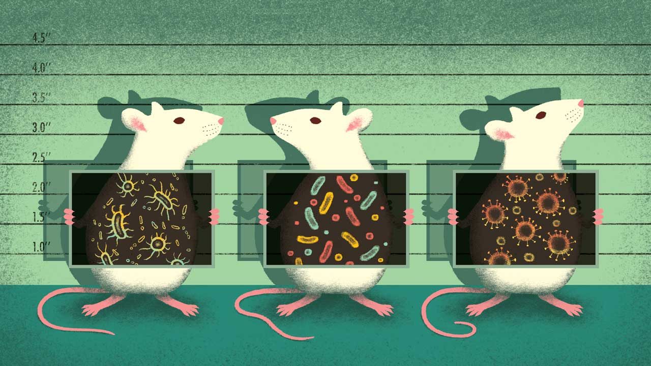
What Lives in Your Belly Button? Study Finds "Rain Forest" of Species
We love Science
Data findings are not so easy to find as they could be. It is not enough to be able to extract, transform and load data. Every project must be easily communicated with the scientific community through data visualizations. With the power of JavaScript, and HTML, scientific research becomes easily accessible without the need to scroll through long articles. The interactivity that JavaScript provides allows users to readily parse dense data to their liking.
Many bacterial species are not well studied, and many more remain unknown to science. In this study we look into the "Rain Forest" of species one can find in their own Belly-Buttons! It is a challenge to predict what species like to call the human body home, and why that is. This study collected samples from a number of participants, and identified an even greater number of bacteria in each navel. Participants can use the interactive charts below to discover more about their Belly-Buttons.
Interactive Charts
Select an ID Number
OTU stands for "operational taxonomic units". The row label identifies the bacteria species, the hovertext defines the number of colonies of said species are in the sample.
Note: Not all colonies have been identified
Bar charts are simple to read and explain themselves!
How often did this person wash their belly button per week? This gauge chart can quickly define the answer!
Gauge charts are visually appealing and grab the reader's attention easily. They can be understood at a glance, and are very simple. Colors can be utilized to suggest "safer" regions. A bar and ticks allow a user to judge a value relative to others in the set.
A bubble chart is a neat variation of a scatter chart, in which the data points are replaced with bubbles. Simply, an extra dimension is added, where data is represented in the size of the bubbles. Both axis are value axis, unlike a scatter chart where axis may represent some category. It is encouraged to use a bubble chart instead of a scatter chart if your data set contains three data series, each of which contains a set of values. Different bubble sizes are useful to visually emphasize specific values.
